Pinewood Baking Logo — Redesign Inspired by Custom Cake Artistry
Pinewood Baking is known for intricately designed cakes and desserts, each created as a unique, custom piece. As the brand evolved, its visual identity no longer reflected the level of craftsmanship and personalization behind its work.
The redesign focused on elevating the brand to match its current position—beautiful, thoughtful, design-driven, and elegant yet highly customized—while maintaining a sense of warmth and approachability. Drawing from the idea of intentional composition and crafted detail, the identity mirrors the process behind each creation. Every element was refined to feel balanced, delicate, and considered, without relying on literal imagery. The result is a mark that communicates through restraint, allowing the artistry of Pinewood’s work to remain the focal point while reinforcing a more elevated brand presence.
Designer: Shayla Hufana
Client: Brittany Brown, Pinewood Baking
Graphic Design USA 2025 Best of the Year Recipient
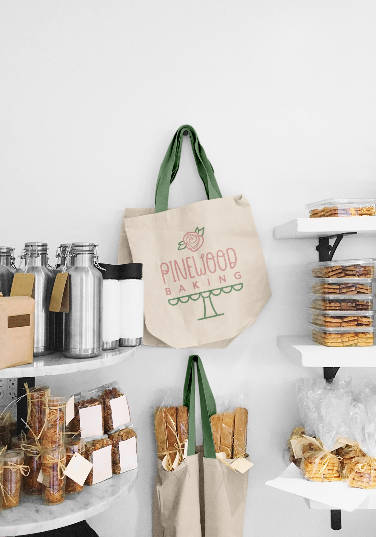
The logo was designed to function seamlessly across packaging, digital platforms, and print materials. Its simplicity allows it to adapt across touchpoints while maintaining a consistent and recognizable identity.


Flyer Designs
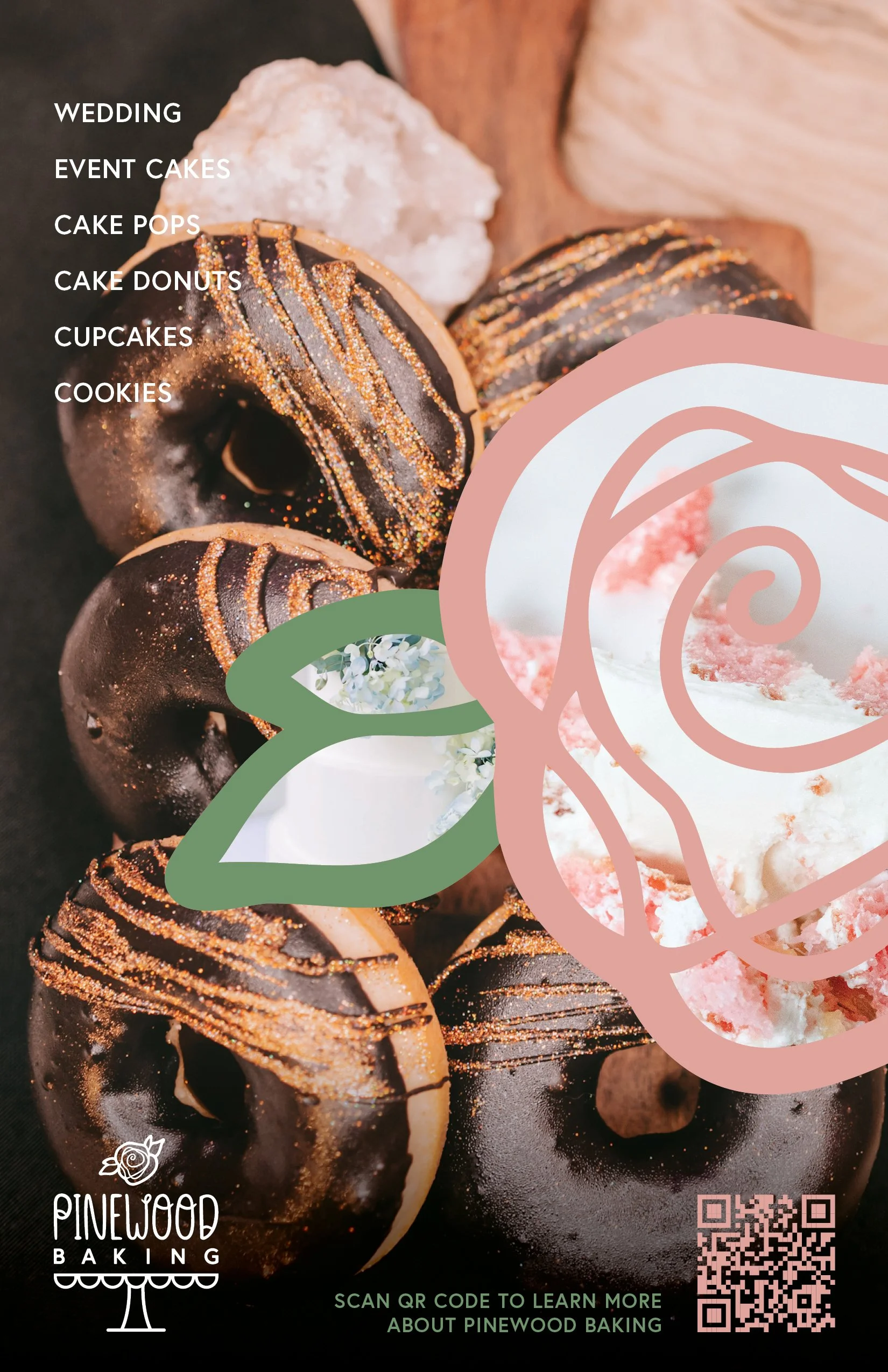
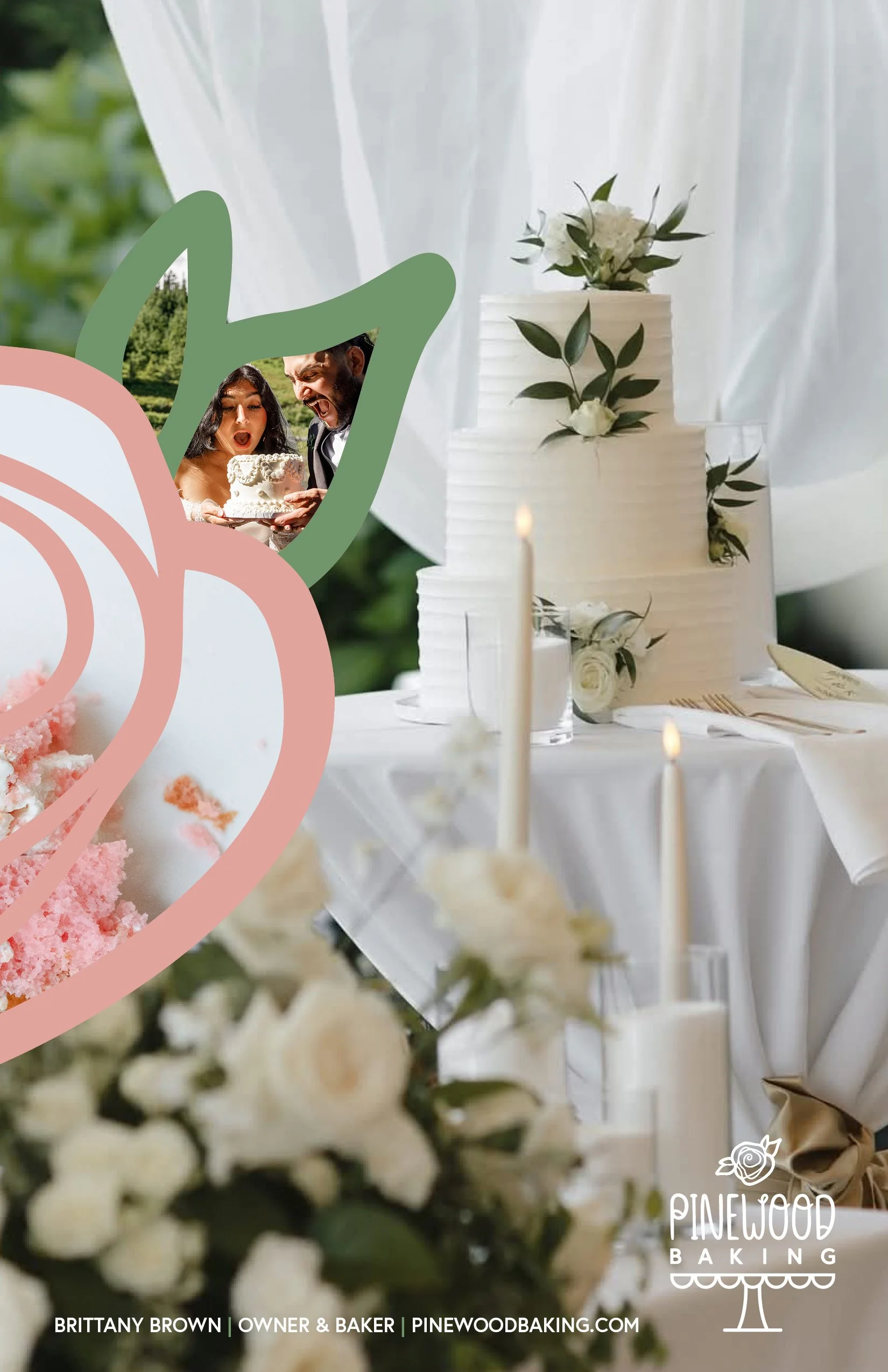
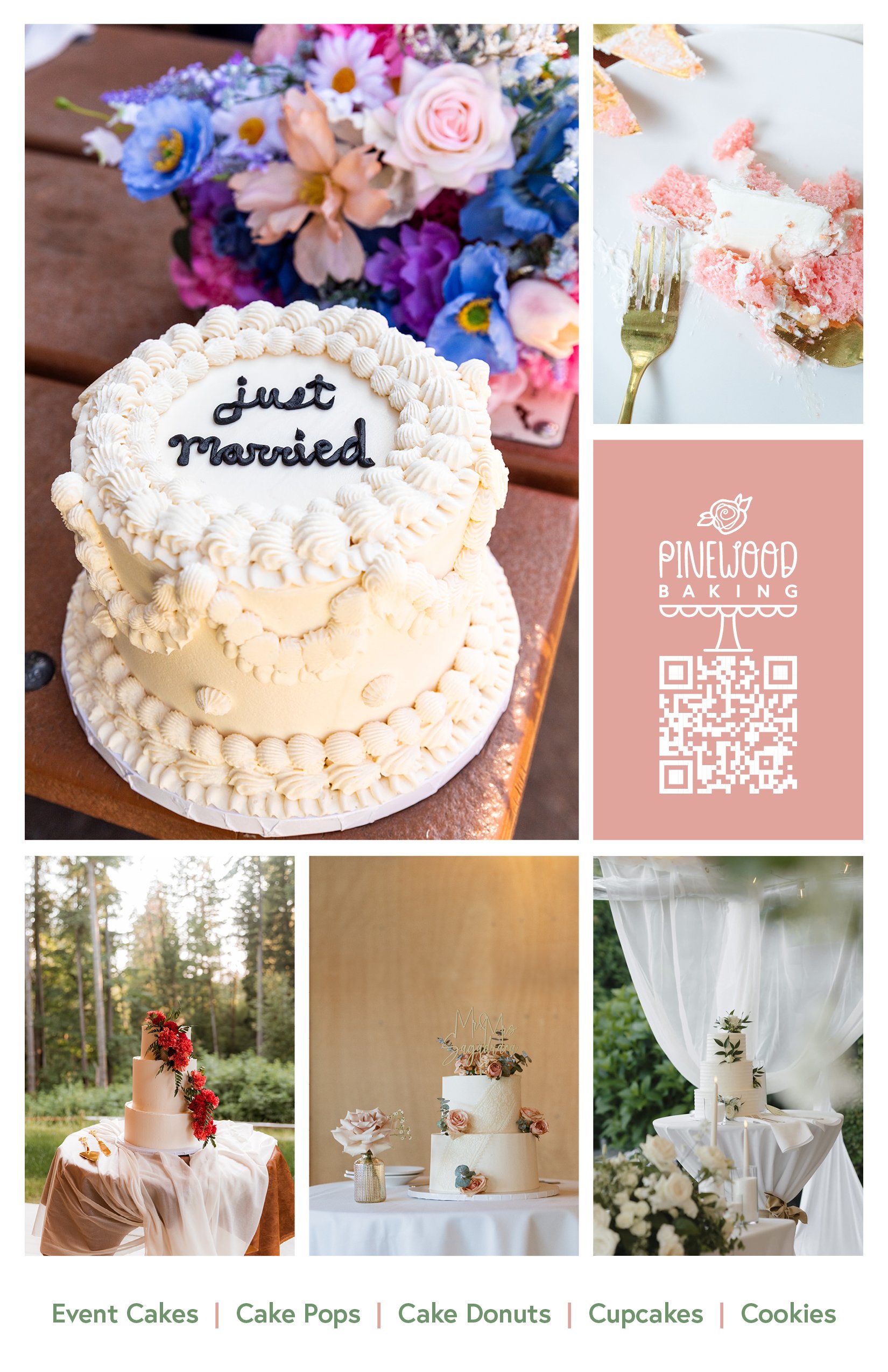
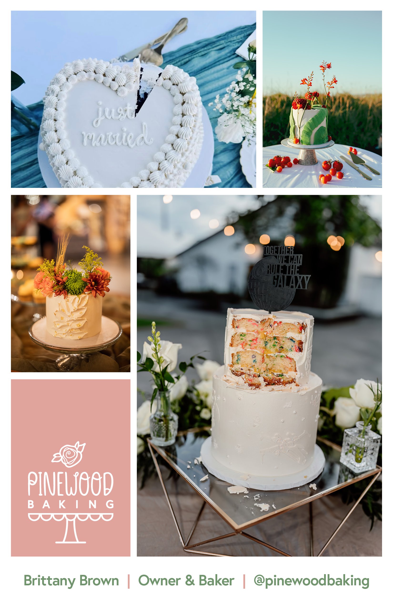
The updated identity reflects Pinewood Baking Co.’s evolution into a bespoke dessert brand, aligning its visual presence with the artistry and individuality of its creations. The result is a more cohesive, refined brand experience that supports continued growth and connection with its audience.