Purple Points Project Logo Redesign: Identity for Finding Common Ground
Purple Points Project is a social impact initiative dedicated to helping people find common ground through structured, meaningful conversation. Built on the belief that thoughtful dialogue can bridge divides, the organization provides tools and frameworks that encourage listening, curiosity, and shared understanding.
As the project evolved, it required a brand identity that could match its growing impact—one that communicates clarity, credibility, and connection.
Designer: Shayla Hufana
Client: Purple Points Project
CHALLENGE
The original identity was rooted in a simple Venn diagram, effectively representing shared space but lacking the refinement, scalability, and clarity needed for broader application.
The challenge was to:
Evolve a grassroots visual into a professional, scalable identity
Maintain the core idea of connection and common ground
Avoid overly literal or overly complex symbolism
Ensure clarity across digital, print, and small-scale uses
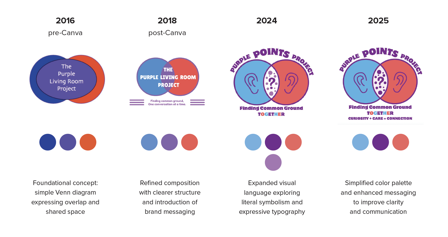
PROCESS & EVOLUTION
Over time, the identity evolved from a simple Venn diagram expressing shared space into a more refined and intentional system. Early iterations introduced structure and messaging, while later explorations incorporated more literal symbols of listening and dialogue.
Through this process, the core idea of connection remained constant—while the visual execution was simplified, clarified, and strengthened—ultimately leading to a more abstract and scalable mark.
CONCEPT
The final direction centers on focused convergence—the moment where different perspectives meet to form shared understanding.
Building on the original Venn diagram:
Two forms come together through intentional overlap
The shapes create two abstract faces in dialogue
They meet at a central “Purple Point” representing agreement
A subtle owl form emerges, symbolizing wisdom and collective insight, while remaining abstract and open to interpretation.
DESIGN SOLUTION
The final logo is a minimal, circular mark that balances clarity with meaning:
Circular form → continuity, trust, and ongoing dialogue
Central overlap (Purple Point) → shared understanding
Red + blue accents → diverse perspectives
Abstract symmetry → balance and equality
The design is intentionally simple and geometric, ensuring it remains:
recognizable
scalable
versatile across all applications
RESULT
The new identity transforms a basic concept into a distinctive, ownable brand mark that reflects the mission of Purple Points Project.
Communicates connection without relying on clichés
Functions effectively at all sizes, from favicon to print
Supports future applications, including digital tools and a board game system
Balances emotional resonance with professional clarity
Ultimately, the design captures the project’s core idea:
Turning conversation into connection—and difference into shared understanding.