
Ube Overload Packaging Design
Ube Overload is a Filipino-inspired bakery known for its delicious, vibrant cookies that celebrate familiar flavors with a playful twist. As the brand continued to grow, it needed packaging that would showcase its best-selling cookies—UbeOverload, Ube Crinkle, and Pandan Crinkle—while creating a cohesive, recognizable look across its product line.
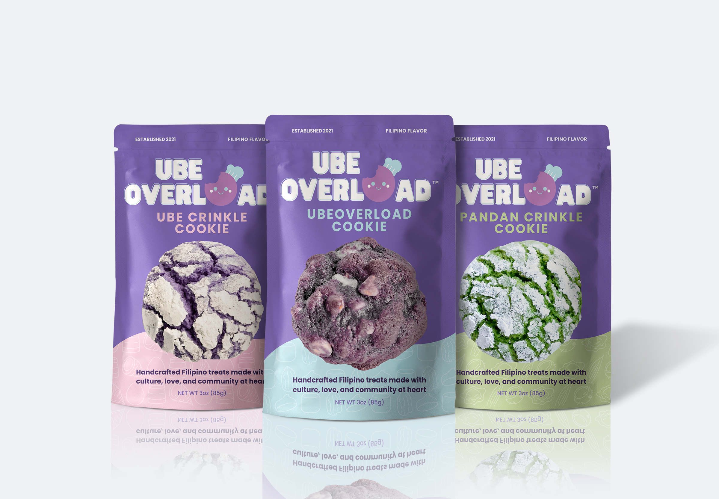
Instead of relying on traditional food packaging, each pouch was designed to celebrate the cookies themselves. True-to-size, top-view cookie imagery takes center stage, surrounded by custom hand-drawn illustrations of ingredients that bring personality and charm to each design. Distinct color palettes help differentiate the three flavors, while thoughtful typography, visual hierarchy, and spacing keep important product information clear, accessible, and easy to read.
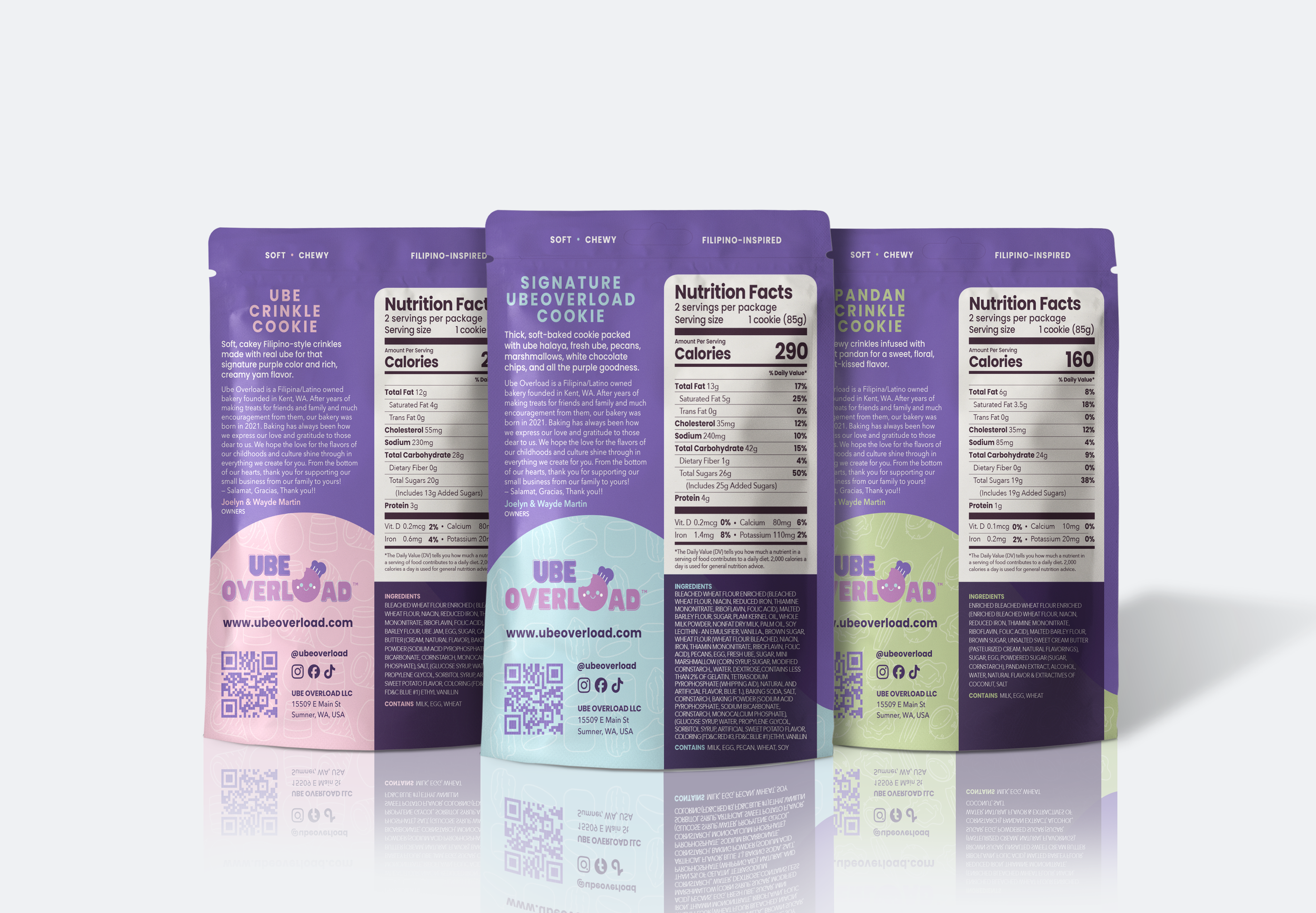
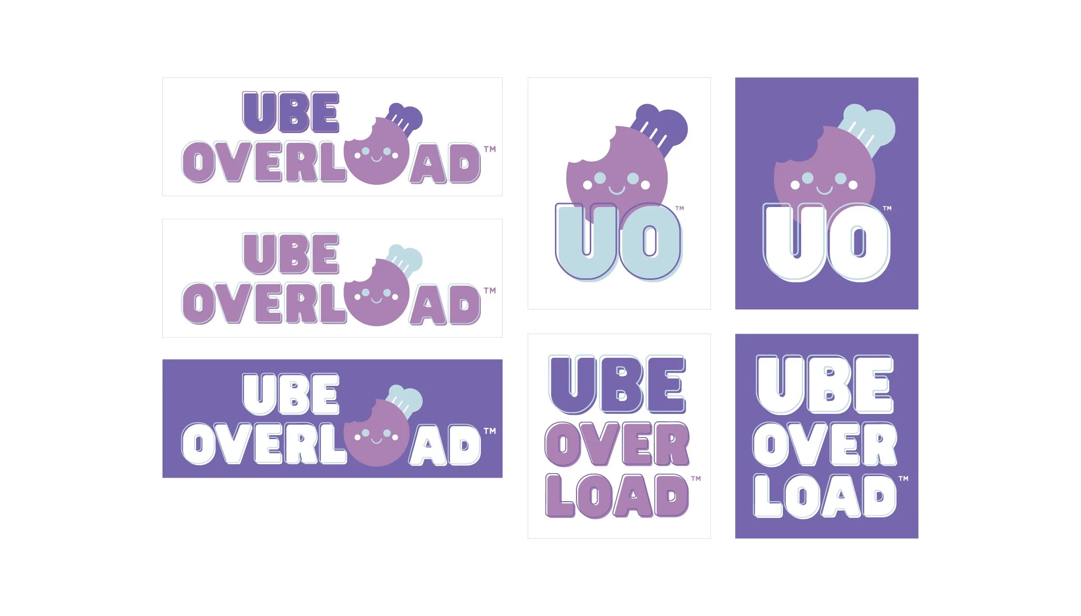
Beyond the packaging, ConceptShell recreated and refined Ube Overload's existing logos into clean, scalable vector artwork. New color variations and flexible logo layouts provide greater versatility across packaging, merchandise, print, and future applications. Together, these elements create a playful, polished packaging collection that celebrates Filipino-inspired flavors while giving the growing brand a more consistent and adaptable visual identity.
Client
Ube Overload
Design Team
Lead Designer / Art Director: Shayla Hufana
Graphic Design Intern / Ingredient Illustrations: Morgan Wong
Print Production Designer: AJ